Technologies > User Interface Add-Ins > HTML Drawing Views > Markup and Redlining
You can use drawing tools in Web Central to mark up or redline HTML drawings, in order to add notes, highlight details, or indicate needed changes. All of these tools are available in the view that contains the drawing.
Note: The term Markup is a synonym for Redmarks and Redlining.
Participants in space-planning phases typically mark up existing floor plans with proposed changes, such as redlining walls to be removed, indicating layout changes or allocation of space by organization, and marking space needs at specific locations. For example, a note might specify, "Need a small conference room here and break-out rooms along this wall."
In a similar way, newly acquired - or even space yet to be acquired - must be included in the planning process. If floor plans are not yet available for new space, planning participants can draw or outline what that space may look like, then indicate more detailed space classifications, organizational allocations, and asset or furniture needs.
In the layout phase of the process, the Space Planner may have changes to suggest in the layout scenario.
Note: API must specify which views include markup capabilities. Then each drawing opened in a designated view has markup tools available.
Example view: http://localhost:8080/archibus/schema/ab-products/solutions/programming/drawing/ab-ex-dwg-html-control-markup.axvw
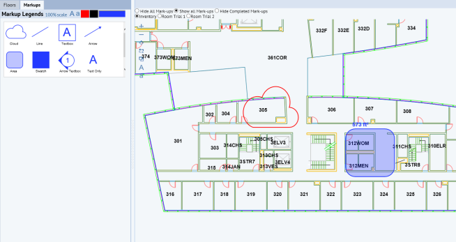
The example below shows all supported features:
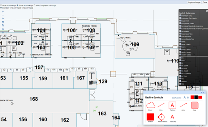
Note that in Web Central, both redline features and markup legends can exist in the same view. You can place redline features and markup legends as required. In the drawing below, markup legends appear in a separate pane on the left.
You can also load markup legends - or redline symbols - in a popup window, lower right in the drawing below:
In a drawing that uses markup tools, you can:
If a corresponding mark-up exists for this drawing, then load the mark-up image:
SELECT * from afm_redlines WHERE dwgname = <dwgname> and layer_name = <layer_name> and activity_log_id = activity_log.activity_log_id and activity_log.project_id = <this move project_id>
Notes:
If you have selected "Hide Completed Mark-ups", then add a filter to the SELECT above:
... and activity_log NOT IN ('%COMPLETED%', '%CLOSED%')
Display a pop-up window that allows you to enter information for the associated activity_log item. Thus you can associate the action item with the move project,and route it to another user (CAD Operator, for example) to communicate changes, if the user has Service Desk.
The pop-up window contains:
Upon saving the pop-up, close it. The system also:
You can capture the screen image and display in a different tab of the browser, then save in PNG format locally, or print.
Goal: to be able to associate - and show - the actual areas of Area Boxes placed onto drawings using Markup Control.
A move scenario planner or space planner sees a newly published layout scenario, but wants further changes to it. An area on the floor that now contains a handful of workstations should become an open plan area. The size should be 800 square feet. To mark up, the space planner draws an area box of 800 square feet around the set of workstations to be converted, and saves this information as a service request to the CAD planner. Alternately, the space planner puts an area box around a set of workstations and wants to know about how much area it represents. If that space needs to change, it's important to know about much area the space encompasses.
The table below lists actions related to Area Boxes, along with a description of each action's effect in the interface:
| Action | Description |
|---|---|
| Drag and drop the Area Box legend to the drawing. |
For Firefox browser, the Area Box indicates Edit mode with the actual area size on top, converted to ft² or m². For IE or Chrome, click the dropped Area Box to invoke Edit mode. |
| Drag resize grips at the bottom right or top left of the Area Box. | Area Size label on top of the Area Box updates accordingly. |
| Click outside of the Area Box to leave Edit mode. |
User has an option to show Area Box label or hide it by specifying 'showAreaLabel' parameter in MarkupControl add-on's config object: parameters['addOnsConfig'] = { ... 'MarkupControl': { ... showAreaLabel: true }, ... }; By default, the label will not show. |
| Zoom in or out of the SVG drawing with Navigation toolbar or mouse action. | Area Size label on top of the Area Box updates accordingly. |
| Change the legend color. | Color of Area Box and Area Size label also change. |
You can make scalable text in labels bigger or smaller.
Labels are typically published and displayed using the same text size. When rooms are small, but labels are long, labels from adjacent rooms overlap. Zooming in does not help because the labels are zoomed with the rooms. Users want to make labels relatively smaller, so they do not overlap. If labels become too small to read, users can zoom in.
The feature applies only to scalable labels, that is, the labels in the published drawing with "em" suffix, such as gros-labels and rm-labels.
For non-scalable labels, such as the ones with "px" suffix or no suffix - jk-labels, fp-labels, pn-labels, or eq-labels - the feature has no effect.
The table below lists actions related to Control Labels, along with a description of each action's effect in the interface. You can change the label size in two ways:
| Action | Description |
|---|---|
| Change Label Size through Navigation toolbar's controls. |
Two controls to adjust Label Size appear in the Navigation toolbar:
Click one control or the other, as required. These controls appear by default in the Navigation toolbar. To hide these controls, set "allowAdjustLabelSize" to false: var parameters = new Ab.view.ConfigObject(); ... parameters['allowAdjustLabelSize'] = 'false'; ... parameters['addOnsConfig'] = { 'NavigationToolbar': {divId: "svgDiv", ... }, ... }; |
| Change Label Size through JavaScript API |
The DrawingsBase class contains the following API: /** * Change the Label font size by the specified factor, * the values will be between 0.2 (min) and 5 (max). * * @param factor the specified factor * @return the current font size */ changeLabelSize: function(factor); To use: //increase label size var fontSize = this.drawingController.getControl().changeLabelSize(1.25); //decrease label size var fontSize = this.drawingController.getControl().changeLabelSize(0.8); |
In the .axvw, add reusable drawing controls' controller and components:
<panel type="view" id="drawingFiles" file="drawing-common-controls.axvw"/>
class=”redline-legend”.<div id="markupLegendDiv" class="redline-legend"></div>
<div id="drawingId"></div>
Define markup control’s config in DrawingControl’s add-on config before the drawing control is constructed:
parameters['addOnsConfig'] = { ... 'MarkupControl': { divId: "svgDiv", panelId: "markupLegendPanel", legendId: "markupLegendDiv", legendTitle: "Markup Legends", colorPickerId: 'markupLegendPanel_head', onChange: this.onMarkupChange, onDrop: this.onMarkupDrop, onSave: this.onSave, showAreaLabel: true } ... }; var svgControl = new Drawing.DrawingControl("svgDiv", "svg_ctrls", parameters);
The table below lists parameters for MarkupControl:
|
Parameter |
Description |
|
divId |
SVG drawing’s divId defined in .axvw file |
|
panelId |
legend's panel id |
|
legendId |
legend's div Id |
|
colorPickerId |
the div id to hold the color picker control |
|
redlineTypes |
An array of redline types to display on the legend panel, default to [ "cloud", "line", "textbox", "arrow" , "area", "swatch", "arrowTextbox", "textOnly"] |
|
onDrop |
Define custom event handler when the legend is dropped |
|
onChange |
Define custom event handler when the legend on the drawing is changed or moved. |
|
onSave |
Define custom event handler when the SVG drawing is saved. |
|
currentColor |
The legend color. Default to #FF0000 (red) |
|
legendTitle |
The title displayed on legend panel’s title bar. |
|
style |
A JSON map to define legendWidth, legendHeight, and legendMargin: { legendWidth: '75', legendHeight: '75', legendMargin: '5px 0px 0px 5px' } |
|
currentFontSize |
The font size for the text box legends, such as "textbox, "arrowTextbox" and "textOnly". Default to 10. |
|
scaleFactor |
The scale factor for dropped legend comparing to the legend original size. Default to 2. If the legendWidth is 75px, then the legend dropped on the SVg drawing will be 150px wide. |
| Method | Description |
| loadLegend: function(svg) |
Loads redline legend and attaches drag-drop event to the given SVG drawing. Parameter:
|
| loadColorPicker: function() |
Loads color picker with custom panel title. Parameters: none. |
| setupMarkupLegends: function(svg) |
Establish the drag and drop relationship between the redline legend and the drawing. Parameter:
|
| setCurrentColor: function(newColor) |
Set the redline control legends to a new color. Where: newColor - Color to set in HTML color code format, such as #FF0000. |
| onDrop: function(params, control, type) |
Calls default events, such as set 'hasUnsavedChanges' and create area size label for Area Box after dropping the markup then calls the custom onDrop event handler. Parameters:
|
| onChange: function(params, node, control) |
Calls default events, such as set 'hasUnsavedChanges' and modify area size label for Area Box after changing or moving the markup, then calls the custom onChange event handler. Parameters:
|
| save: function(parameters, updateIfExists) |
Saves SVG drawing's extent, drawing name, action item id to afm_redlines table. Save redlines and image content (if any) to its document table and update the related file name in afm_redlines table. Capture the floor plan with redlines and highlight, save to activity_log.doc4 field. Parameters:
|
| setCurrentFontSize: function(isIncrease) |
Increase or decrease the current font size for the dropped text legends, such as textbox, textOnly and arrowTextbox. Parameter:
|
| removeGrips: function() | Remove the edit grips from the dropped legend on the drawing, in order to exit Edit mode programmatically. |
Example view: http://localhost:8080/archibus/schema/ab-products/solutions/programming/drawing/ab-ex-dwg-html-control-markup.axvw
| Copyright © 1984-2018, ARCHIBUS, Inc. All rights reserved. |