Open topic with navigation
Environmental & Risk Management / Energy Management / Energy Manager
Meter Analytics Over Time
The Meter Analytics Over Time report enables you to review electrical consumption (kWh) or demand (KW) as a line chart to identify inefficiencies by comparing multiple locations over time. Electric demand values are aggregated as the maximum reading for a period, rather than as a summation.
The report provides key information to help with issues, such as the following:
- Peak Consumption: Utility contracts often stipulate tariffs for any hour during the billing period in which net consumption exceeds a defined limit. By identifying a pattern of high peak consumption at the building level, you can examine the underlying causes for that peak. Responses might include recommending that the organization reschedule certain processes or system operations to level out the energy load throughout the day, perhaps negotiating a different contract with the utility provider, or switching providers to find terms more favorable for the organization’s usage profile.
- Abnormally high base consumption. By comparing the base energy consumption for multiple buildings (that is, the level that remains consistent at all times), you can note any building whose base load is exceptionally high. This high base load might indicate that some necessary equipment at the location is running continuously. For example, a data center or technology lab would fit this description. Drilling down into the building’s sub-meters would show if this is the case. Or, a high base energy consumption might indicate some system is running that should not be, such as emergency air vent fans in a parking garage.
This chart uses aggregated data from the BAS Data – Time Normalized Numeric table, which is created during data processing. The application now processes data for virtual meters and saves it in the bas_data_time_norm_num table with sum or max of component meters. Processing is delayed until all component meters have been processed (for the selected month.)
Generating the Meter Analytics Over Time report
To generate this report, you must provide a data point at the building level. Optionally, you can provide a data point for a level within the building. Virtual meters are included in the drilldown list.
Note: If there's a meter at the building level, but not below, the application does not prorate measured values below the level at which they are physically measured. So, if you have data at the building level, but not lower, then it will not be possible to compare one floor of this building to a metered floor of another building.
To generate this report:
- Select from the following filters, and then click Show in the Filter console:
- Predefined Analysis: Select one of these commonly needed analyses as an alternative to entering individual filter criteria. The application will automatically set the Location Detail and Group By criteria to values that are appropriate for the described query. You can then select the locations from the drill down, and the dates that you want to examine.
Note: If you are working in the HQ database with the HQ sample data, the code detects the HQ data, and preselects those location / meter records that illustrate each predefined query well. When working with your own data, these predefined analyses select the Location Details and Group By settings that are appropriate for the selected analyses, but lets you select the locations and dates you want to examine. This enables you to see all your data, including any gaps or outliers that you would want to analyze.
- Five-year building energy intensity comparison by month. Shows how building energy consumption is trending. This chart can help you analyze the effectiveness of efforts to reduce consumption.
- Facility start-up comparison - hourly. Helps you look at where energy consumption markedly increases, and examine if this is also when the energy is needed. For example, if the building start-up is occurring hours before employees arrive, you could put in a work request to turn systems on at a different time. Or, if certain processes require more energy, you might be able to schedule these processes to occur on alternate days, rather than all at once.
- Facility utilization comparison - daily. Daily consumption at the meter level.
- Consumption anomalies / Recent Consumption Anomalies. The Consumption Anomalies chart shows monthly electrical consumption at the building level over a period of time to help you analyze any sudden leaps in the amount consumed. For example, has there been a change in building use, or has new equipment been brought online? The Recent Consumption Anomalies chart uses the same filters, but you would enter a more recent date range.
- Or, select from the following criteria to create your report:
- From Date / To Date or Date Range (last five years, year, quarter, month, week, or day). When you select a Date Range, the From and To Dates automatically adjust to reflect the range you selected. For example, if you select to show data for the last year, the application fills in the From and To Dates with the dates for the last year, overwriting whatever dates were previously shown there. By default, the From and To Dates are set to show the last quarter.
Note: When computing weekly consumption, the application assumes the week starts on Sunday.
- Group By: Select the grouping for the time line (from Year to Hour)
Note: If the granularity chosen for the chart is smaller than the frequency of data collection, the chart will display, but will have limited usefulness. For example, if data was measured once a month and you select to display data by the Day, then a spike will appear only on days when data was collected. All other dates in between will show a consumption of zero. For most relevance, monthly readings should be grouped by Month or higher, quarterly readings by Quarter or higher, and so on.
Tip:The date range you select affects the groupings that are available. Typically, you would want data groupings that create a manageable number of groupings to review, for example, hourly for one day or hourly for the past week, rather than hourly for a year. For this reason, when you generate data for the last five years, you can group by the year, quarter, or month (not by the week, or hour); when generating data for a week, you can group the data by day or hour.
- Location Detail. The level the data is for (city, site, building, or meter)
- Building Use or Construction Type. This information helps you evaluate if the building's activity or building materials are contributing to consumption values. Together with geographic selections in the location Filter, this enables a fair and relevant comparison.
- Normalize by Area: If you select this check box, the application divides the Consumption Value by the total area included in the measurement. For example, if the meter is measuring electricity consumption for one floor of a building, then the Area Measured field should equal the area of the floor. The value for the area can be viewed by drilling down in the tree control and clicking on the Data Point in the tree. This opens a Details dialog which gives the Area Measured.
- Set location criteria: Use the drill down selection list to select specific locations to report on, and click Show Selected. You can select from the country level down to the meter level.
The chart is generated using your selections.
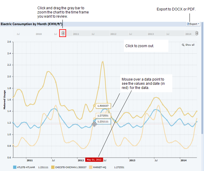
The x-axis labels display the date / time by which the application presents energy consumption values
The y-axis indicates consumption in kWh or, if you select “Normalize by Area,” it presents kWh / area (sq ft or m, depending on the project’s settings).
- To zoom the chart, click and drag the gray bar at the top of the chart. The Chart zooms to show data for the reduced time period. To zoom out again, click Show All. Show All appears when the chart is zoomed in. See HTML5 Charts.
- Export data. Export the chart by clicking Export and selecting either DOCX or PDF for the export.
The Electric Consumption by Month chart appears.
| Copyright © 1984-2016, ARCHIBUS, Inc. All rights reserved.
|