Use row striping and custom cell rendering to aid data visualization.
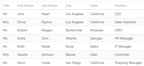
By default, grid control displays alternate background colors in even and odd grid rows, to help users separate rows visually:
By default, grid control displays data values formatted as text using ARCHIBUS schema field properties, or formatting properties defined in the views. Add-in managers can override default data value formatting by providing custom rendering functions for specific columns. This is useful to help users understand data trends, outlying values, safe ranges, and other meaningful aspects of the data.
Custom rendering functions can:
To specify the custom rendering function for a column in JavaScript code:
var grid = View.createControl({ control: 'DataGrid', ... events: { onCellPrepared: function(options) { ... code ... } } });
The control calls the onCellPrepared listener for each cell in regular data rows. To implement custom rendering for cells in rows grouped by category, specify the onGroupCellPrepared listener instead of the onCellPrepared listener.
The control passes these parameters to the listener function:
| Parameter Name | Parameter Type | Comment |
|---|---|---|
| options | Object |
Information about the cell. Contains properties that are specific to the grid control implementation. See API documentation at and example at https://js.devexpress.com/Demos/WidgetsGallery/#demo/data_grid-templates-cell_customization |
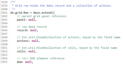
| row | Ab.grid.Row |
Defined in
The |
Example view: http://localhost:8080/archibus/schema/ab-products/solutions/parts/grid/ab-ex-advanced-grid-categories.axvw
Example JavaScript: http://localhost:8080/archibus/schema/ab-products/bldgops/prevmaint/planner/ab-pm-planner.js
| Copyright © 1984-2019, ARCHIBUS, Inc. All rights reserved. |