Calendar Control explains HTML5 calendar controls, which replace Flash control. The following applications use calendar control:
The topic contains these sections:
Overview contains these sections:
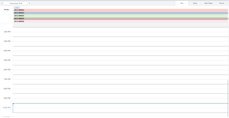
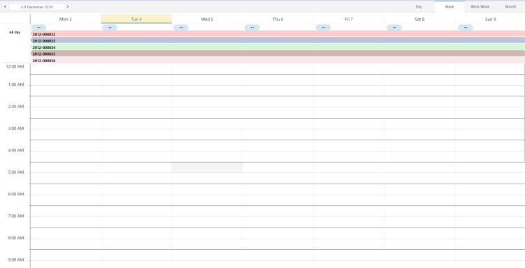
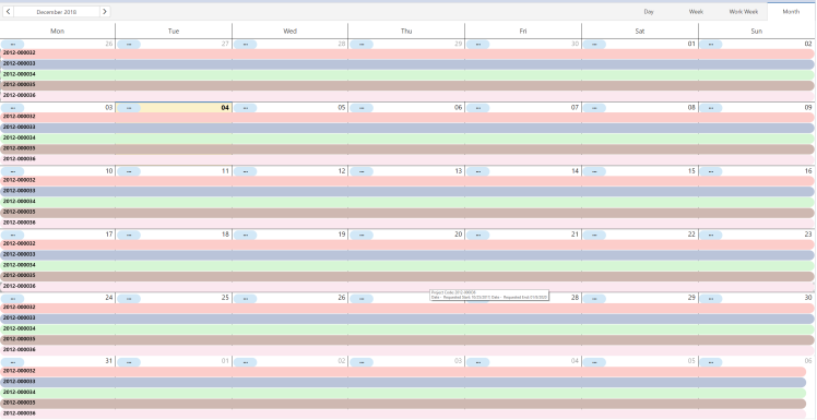
Standard views include day, week, and month views.
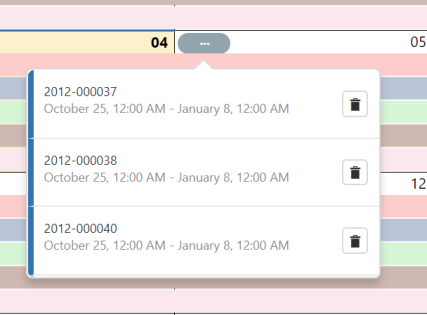
Calendar uses these controls and indicators:
File: schema/ab-core/controls/calendar/ab-htmlcalendar-scheduler-control.js
Control name: HTMLSchedulerControl
Scheduler Control contains these sections:
Initialize scheduler control from JavaScript using an html panel:
<panel type="html" id="projectsCalendar"> <title>Projects Calendar</title> <html> <div id="projectsCalendarContainer" style="width:100%; height:100%;"> </div> </html> </panel>
| Name | Description |
|---|---|
|
config |
The configuration object |
|
dxSchedulerControl |
The dxSceduler control instance |
|
dataSourceId |
Panel dataSource id |
|
dataSource |
Data source object |
|
restriction |
Panel restriction |
|
currentDate |
Current date of view |
|
startDate |
Start date of view |
|
endDate |
End date of the view |
|
views |
Array with available scheduler views. Enum values: - day - week - workWeek - month - timelineDay - timelineWeek - timelineWorkWeek - timelineMonth - agenda |
|
currentView |
The current displayed view |
|
useDropDownViewSwitcher |
Boolean. Specifies whether view switcher uses tabs or drop-down menu. |
|
pkeyExpr |
The data field that provides appointment primary key. When is composite primary key, is an array with field names. Default value: “text” |
|
textExpr |
The data field that provides subjects for appointments. When subject comes from multiple fields, is an array with field names. Default value: “text” |
|
startDateExpr |
The data field that provides start date for appointments. Default value: “startDate” |
|
endDateExpr |
The data field that provides end date for appointments. Default value: “endDate” |
|
displayHours |
Scheduler display hours mode. Values: 12, 24 |
|
firstDayOfWeek |
Specify what is the first day of the week. Integer value. |
|
startDayHour |
Start day hour (start hour of time scale) |
|
endDayHour |
End day hour (end hour of time scale) |
|
cellDuration |
Specify time scale cell duration in minutes. Integer value. |
|
width |
Scheduler width |
|
height |
Scheduler height |
|
disabled |
Boolean, specify if widget responds to user interaction |
|
allowAdding |
Boolean, specify whether possible to add appointment |
|
allowDeleting |
Boolean, specify whether possible to delete appointment |
|
allowUpdating |
Boolean, specify whether possible to update appointment |
|
allowResizing |
Boolean, specify whether possible to resize appointment |
|
allowDragging |
Boolean, specify whether possible to drag appointment |
|
maxAppointmentsPerCell |
Maximum number of appointments displayed per cell. Default value: ‘auto’. |
|
colors |
Array with color values. |
| Name | Description |
|---|---|
|
constructor(config) |
HTML schedule control constructor: - localize Dx Scheduler - initialize control configuration - initialize dxScheduler control instance |
|
initializeDxScheduler() |
Initialize dxScheduler control instance |
|
initialDataFetch() |
|
|
refresh(restriction) |
Refresh scheduler control with restriction: - call beforeRefresh event - do refresh - call afterRefresh event |
|
beforeRefresh() |
|
|
afterRefresh() |
|
|
getDataFromDataSource() |
Retrieve database records from datasource: - call getData - call afterGetData - call handleDataSet – convert database dataset to scheduler dataset |
|
getParametersFromRefresh() |
Get parameters for refresh WFR |
|
getData |
Get data from database |
|
afterGetData |
Call afterGetData event if defined |
|
handleDataSet |
Convert database dataset to scheduler dataset |
| Name | Description |
|---|---|
|
initialized |
Triggered only once, when widget is initialized |
|
optionChanged |
Triggered when a widget option is changed |
|
cellClick |
|
|
cellContextMenu |
|
|
appointmentClick |
|
|
appointmentContextMenu |
|
|
appointmentDblClick |
|
|
appointmentAdding |
Fires before an appointment is added to the data source |
|
appointmentAdded |
Fires after an appointment has been added to the data source |
|
appointmentDeleting |
|
|
appointmentDeleted |
|
|
appointmentUpdating |
|
|
appointmentUpdated |
|
Task Scheduler contains these sections:
| Name | Description |
|---|---|
|
record |
Ab.data.Record object |
|
control |
Scheduler control |
|
taskId |
The id of the task. Database primary key. For composite primary key, all fields values are concatenated with multiple value separator. |
|
text |
Task summary (subject). When multiple fields are used for summary, all values are concatenated. |
|
startDate |
Task end date |
|
endDate |
Task start date |
|
color |
Task color (hexa value) |
| pkFields | Names for primary key fields. When is composite key, is an array with field names. |
| Name | Description |
|---|---|
|
constructor(record, pkFields, control) |
Default constructor. Parameters:
|
|
getTaskId() |
Returns the task id |
|
setColor(color) |
Set task color. Color definition: hexa color code. |
|
setStartDate(date) |
Setter for start date |
|
getStartDate() |
Getter for start date |
|
setEndDate(date) |
Setter for end date |
|
getEndDate() |
Getter for end date |
|
getTooltip() |
Returns task tooltip – formatted with user locale |
|
getPkRestriction() |
Returns Ab.view.Restriction object from primary keys |
|
_getPkValue() |
Returns pk value from Ab.data.Record |
|
_initializeTaskFields() |
Initialize task fields |
|
_getTaskText() |
Initialize task text field |
Sample views
See these sample views, located in the /ab-products/solutions/parts/htmlcalendar/ folder:
| Copyright © 1984-2019, ARCHIBUS, Inc. All rights reserved. |