Use marker control to:
Marker control does not inherit from HTML drawing control. Rather, HTML drawing control incorporates marker control as an add-on.
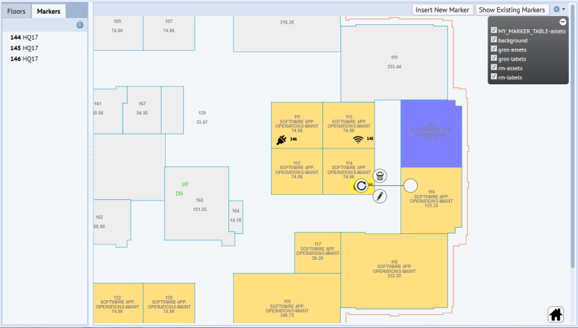
The following Solutions Template views demonstrate markers:
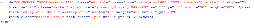
The HTML syntax for a marker symbol resembles:
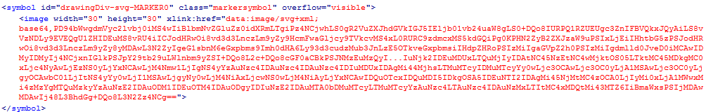
where the symbol definition for the wrench is:
The image of the symbol is a base64 string, centered to the x, y position of its parent <g> node. The splotch enables styling and click-touch events. The label for the symbol also resides on the same layer to facilitate dynamic scaling as users zoom in and out of the drawing during clustering (see Cluster Control).
To minimize the footprint of the drawing, the images are <use> elements, similar to published assets. The base64 images themselves reside in the <def> section as unique entries. Uniqueness is defined by the image, width, and height. Consolidation is performed client-side, as each marker is added to the drawing via addMarker().
Similar to markers, symbols generated from publishing will typically contain a <use> element, with a reference to a definition in another section of the drawing. However, the symbol information is stored in the drawing. If you needed to update the position or change the image, you would need to do so in the CAD drawing and then republish.
Marker symbols used by the Marker control reside in the database, in a table that you choose, with an image that you choose. Each symbol corresponds to its own record. For a particular layer, you should either use published symbols or marker symbols, but not both. If you do use both, only the marker symbols will be able to move and be editable on the fly.
It's best to use .svg format for a marker symbol.
To convert an image to a marker (data-uri/base64 string), you can use utilities such as:
The Web Central Solutions Template example uses the afm_redlines table to store each marker. The following fields in afm_redlines store marker information:
afm_redlines.rotationafm_redlines.layer_nameafm_redlines.redline_typeNote that the Marker control does not using the position fields to store the diagonals. Rather, the Marker control uses the position fields to store the x, y, width, and height of the marker.
The Marker control allows you to save symbol information to other database tables, but you will need a similar set of fields to store this information. You may even use a standards or validating table to store unique instances of the symbols, and then reference those symbols.
Include the necessary libraries and files for the marker control. In WebCentral, you can simply include one file (ab-common-controls-marker.axvw), which will in turn, include all control resources specific to the marker control. In addition, you will need to include the drawing control files.
<panel type="view" id="markerFiles" file="ab-common-controls-marker.axvw"/>
Add an HTML panel with a <div> to hold the drawing:
<!-- drawing panel -->
<panel type="html" id="drawingPanel" dataSource="none" region="center">
<title></title>
<html>
<div id="drawingDiv"></div>
</html>
</panel>
The legend panel is created entirely by application code. (Could be a popup, for example.) After selecting a symbol in the legend, call the placeMarker() api to place the symbol on the drawing.
Similar to other drawing control add-ons, you use the drawing control's addOnsConfig object to enable the marker control:
// enable the marker and cluster add-ons
parameters['addOnsConfig'] = {
'Marker': {'divId': 'drawingDiv'}
};
// load drawing
this.drawingControl = new Ab.svg.DrawingControl("drawingDiv", "drawingPanel", parameters);
To access the marker add-on, use the drawing control's getAddOn() API:
this.markerControl = this.drawingControl.getAddOn('Marker');
After selecting a marker from the marker legend, call this API, which performs the following sequence of events:
addMarker() to insert the selected symbol onto the drawing.For example:
markerControl.placeMarker(svg, parameters);
where:
svg is the targeted svg floorplanparameters is the marker object. (See the" Marker Object Properties" section at the end of this topic.)Creates and inserts a marker symbol onto floorplan, attaching any event handlers and labels.
For example:
var image = markerControl.addMarker(parameters);
where:
parameters is the marker object. (See the" Marker Object Properties" section at the end of this topic.)<image> elementaddMarker() automatically calls this method, so ordinarily, you should not need to use this API.
For example:
setLabel(parameters);
where parameters is the marker object. (See the" Marker Object Properties" section at the end of this topic.)
addMarker() automatically calls this method, so ordinarily, you should not need to use this API.
Example:
move(parameters);
where parameters is the marker object. (See the" Marker Object Properties" section at the end of this topic.)
removeMarker() deletes a marker and its label from the floor plan. This method removes the markers from the floor plan. It does not make changes to the database.
Example:
removeMarker(id);
where id is the id of the marker to be deleted.
To remove all markers from a given layer on the floor plan, use:
markerControl.removeMarkers(layerName);
where layerName is the name of the maker layer (such as eq-assets). This method removes the markers from the floor plan. It does not make changes to the database. This is handy because it is often faster than fetching and reloading the drawing.
After moving a symbol, you can specify a callback function. In this callback function, the application level has full control over what to do once the user has finished moving a symbol from one position to another. For example, you might choose to save the new position right away or to first seek confirmation. If the user chooses to seek confirmation and chooses Cancel, allow the symbol to fly back to original position.
Example:
returnToOriginalPosition(node, toX, toY, toRotation)
where:
node is marker to be removedtoX is the x position to return totoY is the y position to return totoRotation is the angle of rotation to return toUse the Drawing Control’s findAsset() method to locate markers. Note that the marker structure will be different, but you just need adjust the .css styling accordingly. For example, traditionally, the default css class for highlighting a room is:
// to highlight a room
.zoomed-asset-default {
fill: yellow;
opacity: 0.8;
stroke: #000000;
}
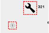
Because markers can be read-only images, to highlight a marker, you need to apply the style to the .splotch instead, such as:
// to highlight a marker
.zoomed-asset-default .splotch{
stroke: blue;
stroke-dasharray: 5, 2, 5, 1;
stroke-width: 5px;
}
You can keep both in the .css file. But when you pass in the parameter in findAssets, use zoomed-asset-default.
Patch any <use> elements in the floor plan for the specified layer. Mainly used for searching a symbol. Storing the published symbols is not supported.
Example:
patchAssets('eq-assets');
where:
- name of the layer table is eq-assets
| Property | Example | Comments |
|---|---|---|
| icon | ‘data:image/svg+xml;base64,PD94bWwgdmVyc2…’ | The 64-base string that holds the marker symbol |
| layer | ‘eq-assets’ | Name of drawing layer that the symbol should reside in |
| width | 30 | Width of the marker symbol |
| height | 30 | Height of the marker symbol |
| scope | Self | Scope |
| handler | self.afterInsert | Callback for when the marker is placed |
| clickHandler | Self.onClick | Called when a marker symbol is clicked |
| moveEndHandler | Self.onMoveEnd | Called after moving a marker symbol |
| beforeDeleteHandler | Self.onBeforeDeleteHandler | Called after clicking the trashcan/”Delete” icon (see note below) |
| deleteHandler | Self.onDelete | Called after beforeDeleteHandler* |
Typically, for event handlers, the core control attaches a listener to a method passed in by the application code. The application code then takes on full responsibility of what happens next. Here, the ‘Delete’ action contains some reusable components, some parts that are handled by application code, and some parts that are handled by core code.
The following sequence outlines the workflow of the ‘Delete’ icon and the relationship between beforeDeleteHandler vs. deleteHandler:
beforeDeleteHandler() to specify a function.beforeDeleteHandler() function indicates that symbol should not be deleted, return. Core code does nothing else. Application code will provide feedback to user.beforeDeleteHandler() indicates that symbol can be deleted, proceed with Item #3. delete() handler to do something, such as attempt to delete item from the database via a workflow rule.To summarize, basically, use beforeDeleteHandler if you need to do something before bringing up the delete confirmation and subsequent deleteHandler function. In the beforeDeleteHandler function:
deleteHandler.| Copyright © 1984-2018, ARCHIBUS, Inc. All rights reserved. |