 ). See Maximizing, Filtering, and Exporting KPI Charts.
The Real Property and Lease Administration's Portfolio Management application presents aggregated data for your portfolio items in charts of key performance indicators (KPIs). For example, KPI charts can show the estimated area for your buildings by location, or the estimated area by availability. You can apply filters to charts to target the data that is relevant to your analysis. For charts that show data grouped by geographic location, you can drill down to see a chart grouped by the next geographic level. Drilling down enables a progressively more detailed view of your data, and can be useful when doing root cause analysis.
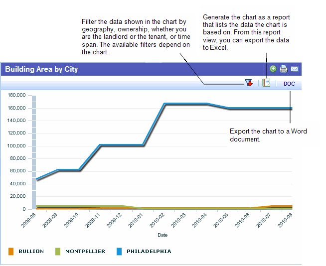
You can generate a paginated report for a KPI charts by clicking the DOC button.
You can generate key performance indicator charts from the Process Navigator, or you can view them as part of the Portfolio Management Dashboards for Buildings, Structures, Land, or Portfolio Summary. When viewing charts from the dashboards, to examine a chart more closely, to filter the data, or to generate it as a report, click the Maximize button (). See Maximizing, Filtering, and Exporting KPI Charts.
You can add a legend to a chart by right-clicking the chart, and selecting a legend position from the context menu. See Adding Legends.
The key performance indicator charts include:
The application require geographic data to place portfolio items in the selection lists that are grouped by location, to enable drill down in charts based on geography, and to place items on maps. For this reason, it is recommended to enter complete geographic information. As you enter data for your buildings, structures, and land using the Add/Edit task, be aware that specific geographic data is needed to have the following results:
To enable you to analyze current use, examine trends, and to project future needs, the following KPI charts group your data by time:
Projections and past data are summarized based on lease expiration dates, and transactions status at the time being reported on, such as whether the portfolio item was owned or the transaction was in the pipeline. By default, these charts show your data for the past year, but you can filter the data to present the past three years, the past five years, the next year, the next three years, or the next five years.
For leased portfolio items, you can select to assume renewal for KPI calculations. That is, if you select the Assume Renewal for KPI Calculations check box for the lease and a time frame is selected for a KPI chart that is after the lease's expiration date, the leased area is included in the KPI calculation. Select this check box when you are confident of lease renewal, and want to include the area represented by the suite in your projections. See Entering Leases
KPI charts have a Maximize button  in the title bar that enables you to view the chart in its own panel to more closely examine it. From the maximized view, there are two icons available that enable you to filter the data shown in the chart and to generate the chart as a report, or to export the chart to a Word document.
You can generated a report (Word document) for the chart by clicking the DOC button at the top of the report. You can generate the chart as a report view that lists the data for the chart. From this view, you can export the data to Excel.
The following image shows the icons from the maximized view:
See Also
Drilldown for Charts Grouped by Geography
| Copyright © 1984-2019, ARCHIBUS, Inc. All rights reserved. |