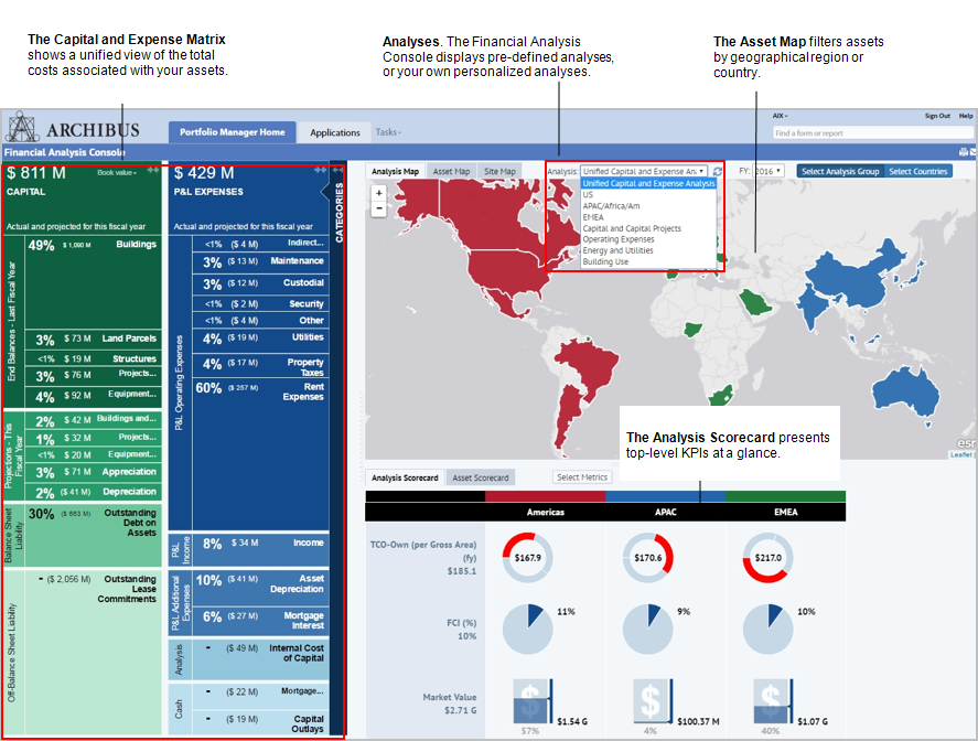
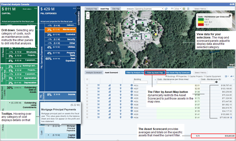
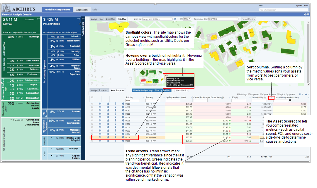
The Financial Analysis Console presents data in the:
- Capital and Expense Matrix that shows total costs by cost category
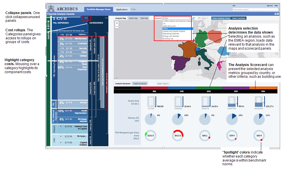
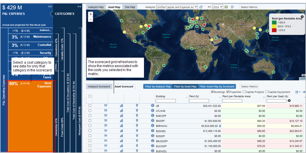
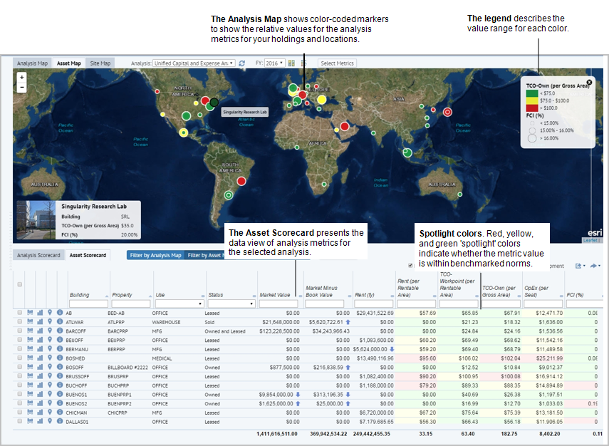
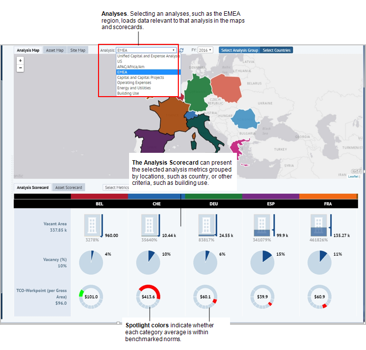
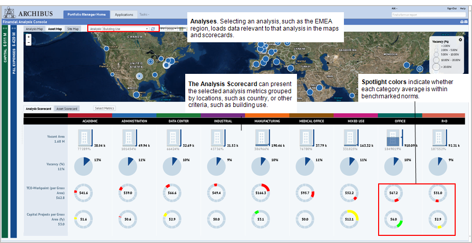
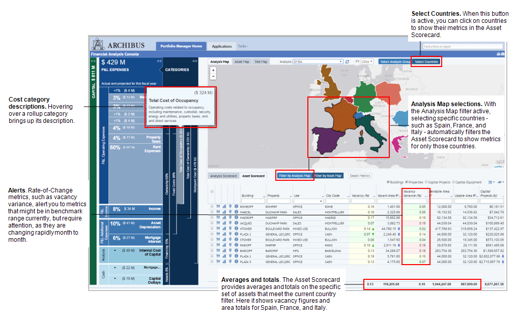
- Asset, Analysis, or site maps that show locations and metrics for the analysis you select from the Analysis list.
- Asset or Analysis scorecards that show data for the cost categories you select in the Capital and Expense Matrix and for the selected analysis
The following image shows the Capital and Expense Matrix, and the Analysis Map and Analysis Scorecard for the Unified Capital and Expense analysis.
For more information on working with different maps, see Asset, Analysis, or Site Maps.